This project involved creating an app that would work like a rolodex, but with tequila, with a list of all of their available products for tasting while giving the user the experience of logging their favorites, sharing with friends and viewing purchase information. OLA Mexican Kitchen are known for having the largest variety of tequilas in the region, and often host tequila tasting events. My team and I were tasked to improve the customer experience in the restaurant by boosting tequila sales. This was done by ensuring the basic restaurant information was displayed, that the UI design be intuitive, clean and functional.
Target Audience: Food lovers, tequila enthusiasts, couples, singles, college graduates, income of 50k+, ages 25 – 55. Upon completion the app was made available on the Apple App and Google Play Stores.
Details:
Duration: 4 months
Team: Mavi Laidlaw Designer, Project Manager and Developers
My role: UX research, sketches, design, usability testing, visual design
Tools: Sketch, InVision, Photoshop, Illustrator
Deliverable: Live App
My Role:
Initial brainstorming through sketching and wireframing
Creating user flows
UI Design
Usability testing post development
Fine adjustment fixes
Communicating details to developers
The Challenge:
How can we create a better tequila tasting experience for customers of OLA Mexican Kitchen?
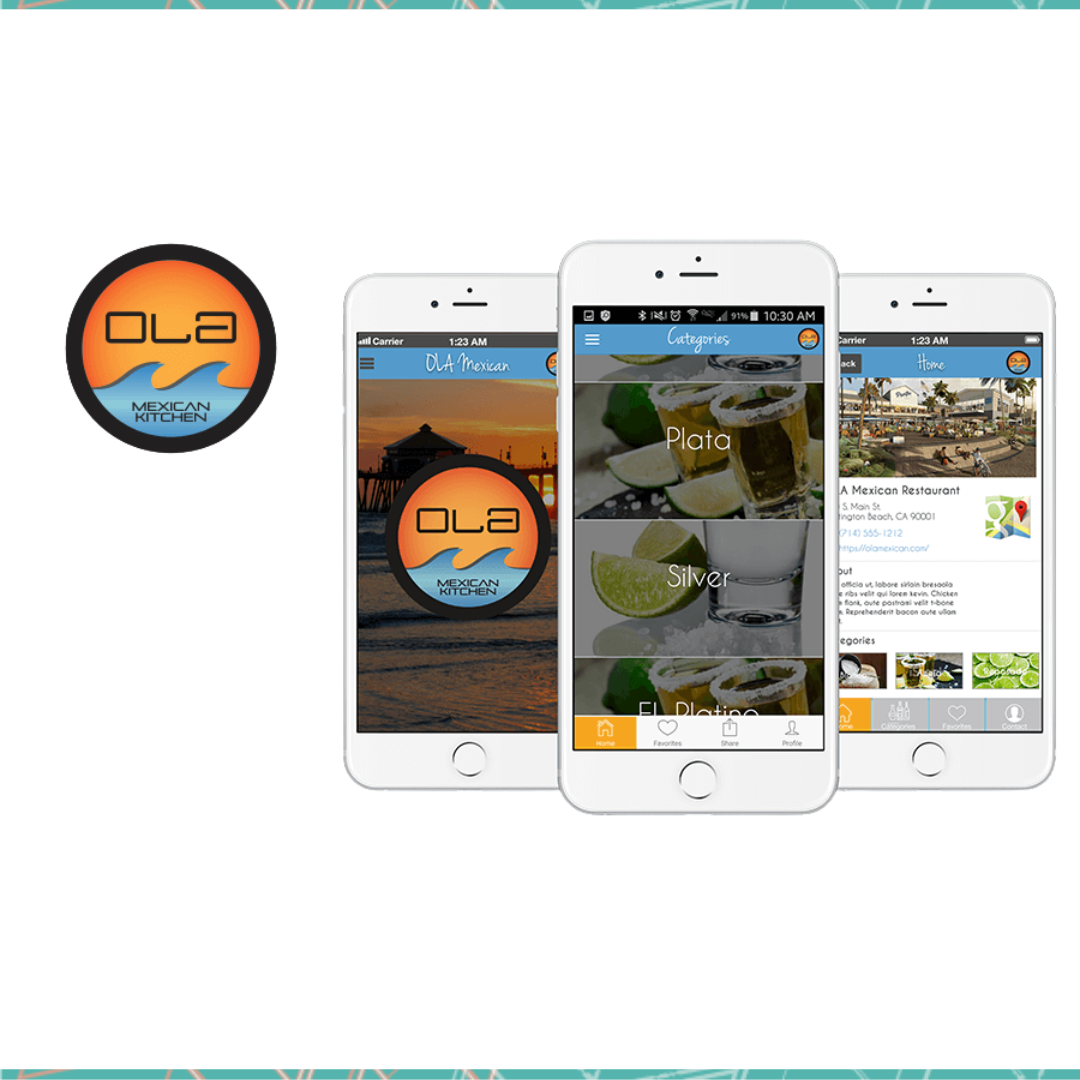
Introducing the Ola Mexican Kitchen App
Moodboard
When I think tequila, freshly cut limes, salt and shot glasses come to mind. When I think huntington beach pier, I think of the sunset, plus the logo has the colors of the sunset in it, this makes up the moodboard.
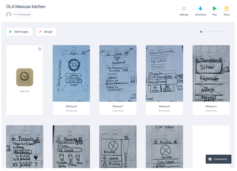
Sketches
I started to formulate design concepts by brainstorming and sketching out ideas, then my team and I discussed the ideas and refined them. We decided to move forward so I started with the sign-in, sign-up screen solutions. And I added notes for the developers for pop-up notifications we should include as a (Call to action)
for the users. Then I continued sketching the remaining screens, the category view listing out the tequila types. Product views in list and grid view. The side navigation, customer profile screen, About us sections and post splash screen home page views.
Low Fidelity Prototype (P.O.P)
I created a quick prototype in POP (Prototype on paper) to share with the team, click below to view it.
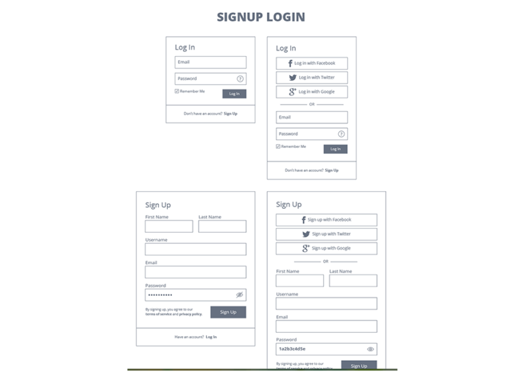
Once the sketches, and prototype on paper were approved I began wireframing the login screens so that the developers could advise if they could apply the functionality.
Design Patterns
I sent the client a few design patterns in wireframe form showing how the solutions would function in their app. I shared the following screen types from a design pattern site first.
Sign-in/sign-up
Walkthroughs to introduce the app
Mobile E-Commerce for the products and different views
Filter
They approved all of these ideas except for the filter as this was too complicated for the first version of the design. I started working on a few visual design patterns and shared those ideas with the team, they liked the direction this was heading in.
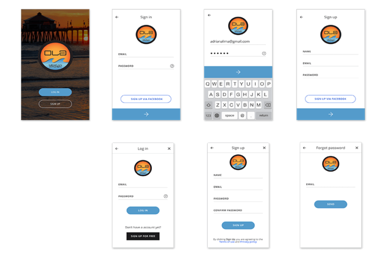
Design Phase
Designed Screens – Sign-in Process
I used the wireframes as a guide for the design of the sign-in screens, adding in the branding colors, logo and details needed to make the screens be a great user experience.
App Icon
The Restaurant already had an established brand that they wanted to use as the app icon so designing the app icon was not difficult I just played with the colors and thickness of the circle in the logo itself.
Customer journey
Once I completed the design of all of the screens I sent the development team a customer journey for guidance on the interactions of the app.
Category View
Images of headlines
Silver
Reposado
Añejo
Mezcal
Home Screen View
Navigation Tab Bar
Home – Overview of the Restaurant
Image of the Restaurant
Address & Map
Contact & Website Info
About
Menu Bar
Products List View
Search
List of Products in three columns
Image of shot glass
Name of product
Rating system below it
Favorite hearts (select/deselect)
Favorites View
Can switch between grid & list view
Search
Display of favorite items
Side Menu View
Name (Icon)
Home
Profile
Favorites
Logout
Profile View
Name (Icon)
Fields for Customer information
Change Password (button)
Update Profile (button)
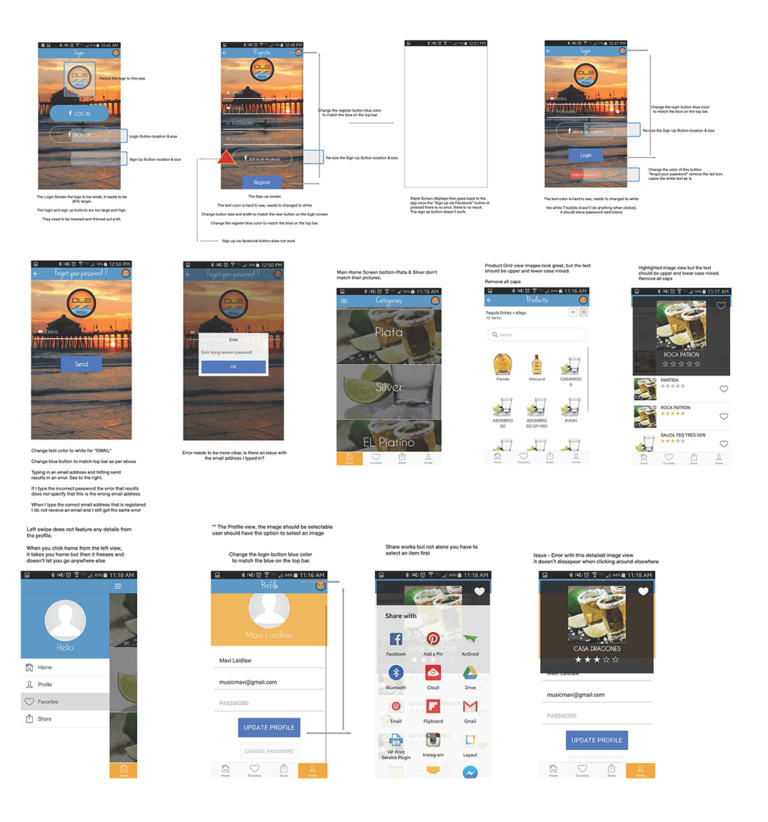
Refinement and Developer collaboration
The development process began, they created a test app and uploaded it to a test site on the google play store where I downloaded the app and evaluated each screen. I began documenting and taking screenshots of the issues for the developers to fix. Multiple bug fixes later the app was live on both the Google and Apple App Stores.
Conclusion
During this project I learned a lot about working directly with a development team to launch an app live. Instead of designing from scratch I started with a template that the developers had chosen. Luckily having some coding experience I found it easier to express the issues that arose during the testing phase. The turnaround time was much more rushed than I expected but overall from start to launch it took a few months, I’m glad we had the time to test before the app could launch on the Apple Store to fix the bugs and iron out all of the details. Here’s the proof that this app was launched and was live on the app store in 2015, however as of 2018 the restaurant decided to no longer use the tequila rolodex.