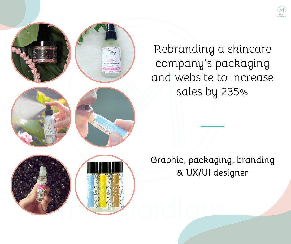
A re-branding project for a skincare company named Tolly’s Treatments that makes all-natural home and body products using high-grade essential oils. This was a full re-brand, packaging design and e-commerce website. All the updates boosted sales by 235%
To increase sales for a small business by changing the way the target market perceives the Tolly’s Treatments products.

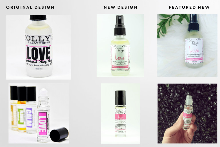
New logo was to remain similar to the original. A thick, chunky, typewriter font, in a black color at 100% opacity. All products in the line should have a color variation but be consistent with other lines in the same primary color set. Product label: Simple, clean, bold. She was interested in having illustrated patterns such as fruit or images of the ingredients on the labels.
The products should convey a feeling of calm, relaxation and love. Tolly’s Treatments wanted the new design to be fun, luxurious but not pretentious. She had a dream of having her product sold in Nordstrom stores.
Since the goal was to be sold in Nordstrom stores, I performed market research by evaluating full lines of products in a multiple spectrum of designs. Target audience: 20 – 55, female, middle to upper class, looking for clean products.
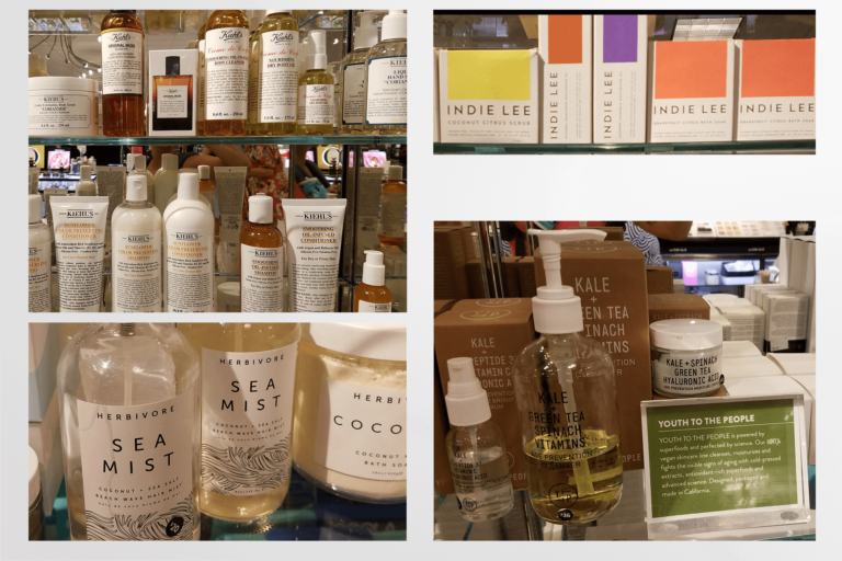
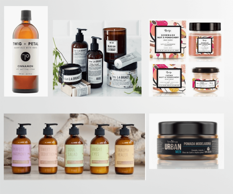
I chose to compare Tolly’s Treatments to Direct competitors: Twig & Petal, LA Bruket, Baija, Farmaervas. The things the brands had in common was that they all had similar ingredients. The design was clean, basic, the label contained a lot of white space and it had an apothecary look.
The label lacked those qualities of romance. The other thing I noticed was that the lip balms, rollers and air sprays were all designed differently and the descriptions used were also inconsistent. The goal was to make all of the products look and feel like they were part of the same brand, while conveying the feeling of Love, Calm, etc.
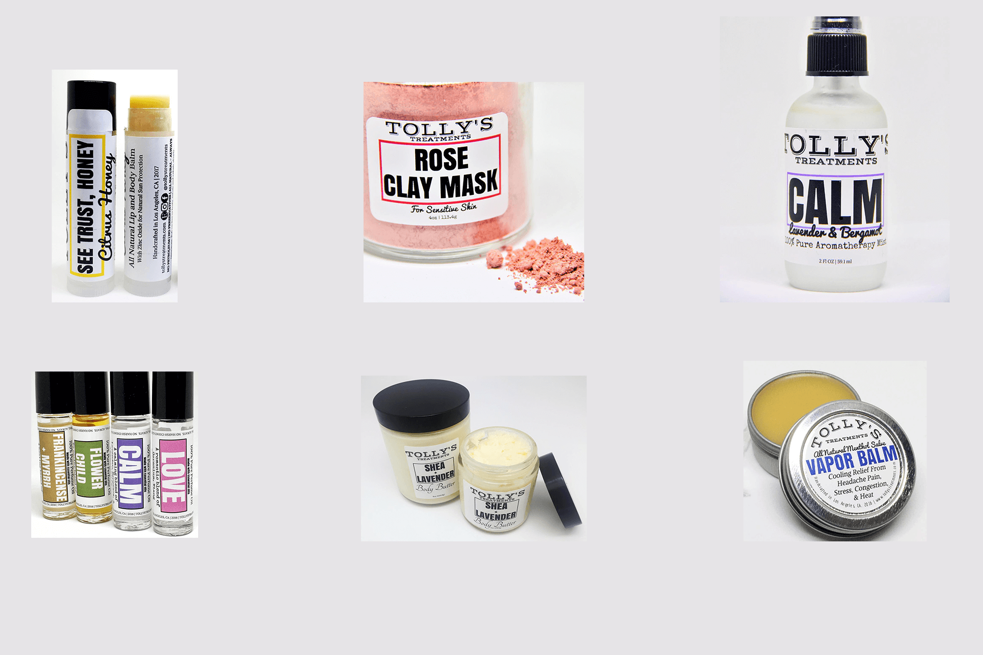
The logo and packaging design was originally created by the client. The logo was set in a typewriter font in all caps with a drop shadow. On the label the logo was taking up 35% of the real estate, there were a total of five unique fonts on each label. In one example, the Air spray product: Love the description was listed as – Geranium is peaceful, “Ylang Ylang is an aphrodisiac”.
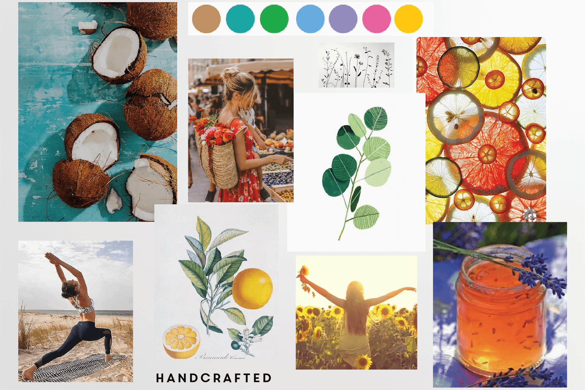
I searched for illustrative images of all of Tolly’s Treatments ingredients: Lavender, blood orange, lemon, geranium. Despite the clients desire for a masculine feel I knew the target audience was mostly female and I wanted to attract them so I went for a more feminine vibe but with plenty of white space.
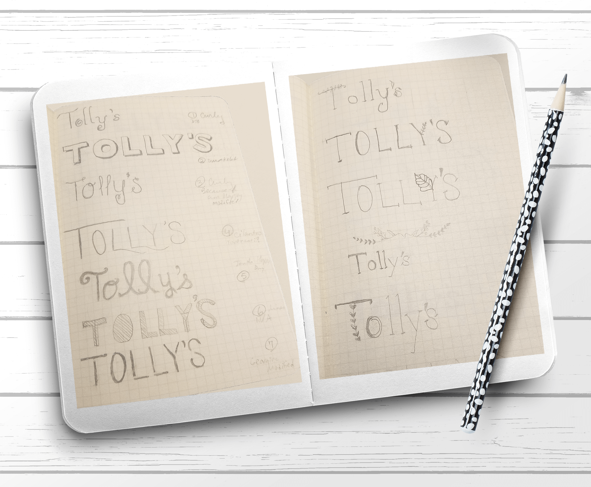
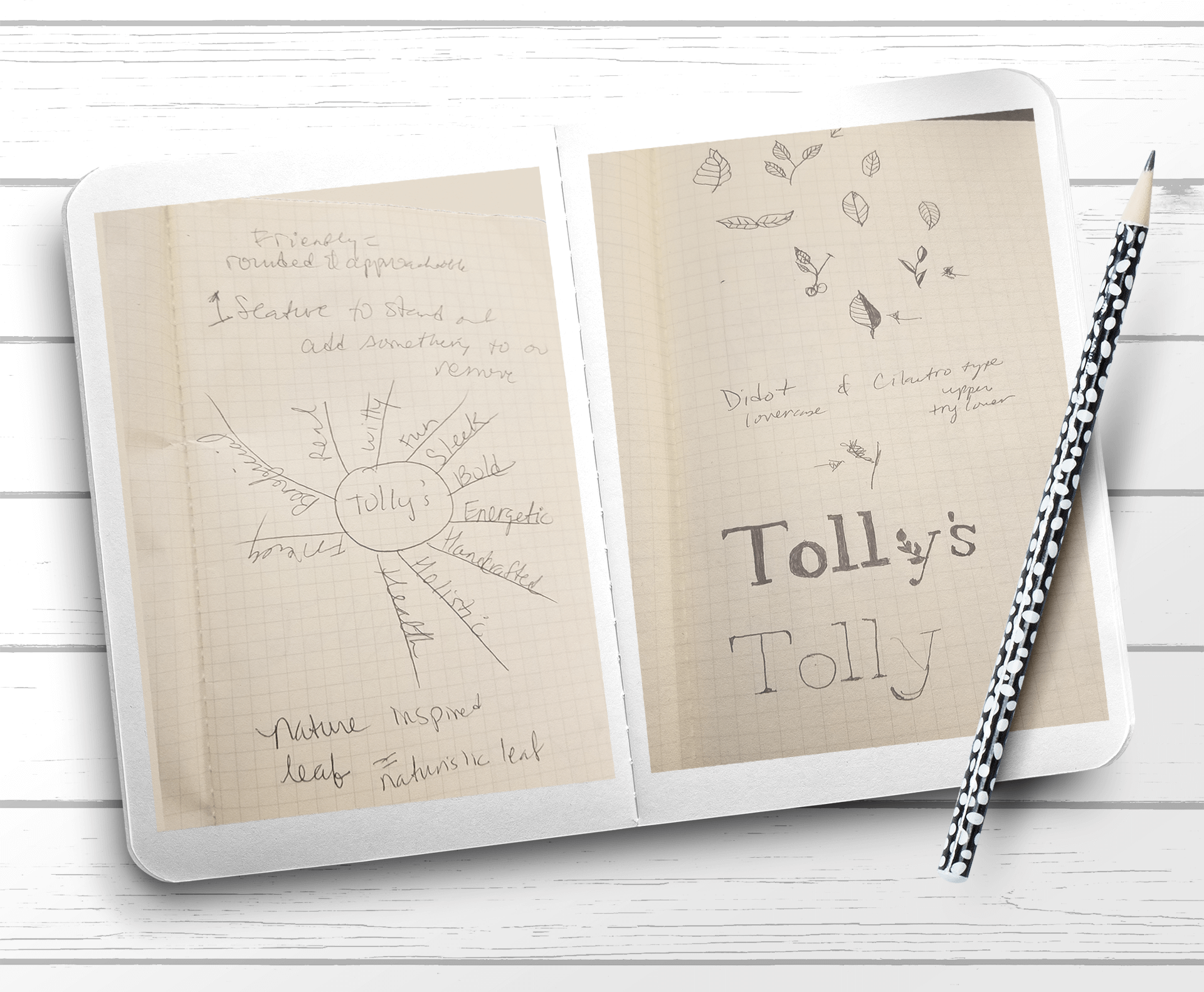
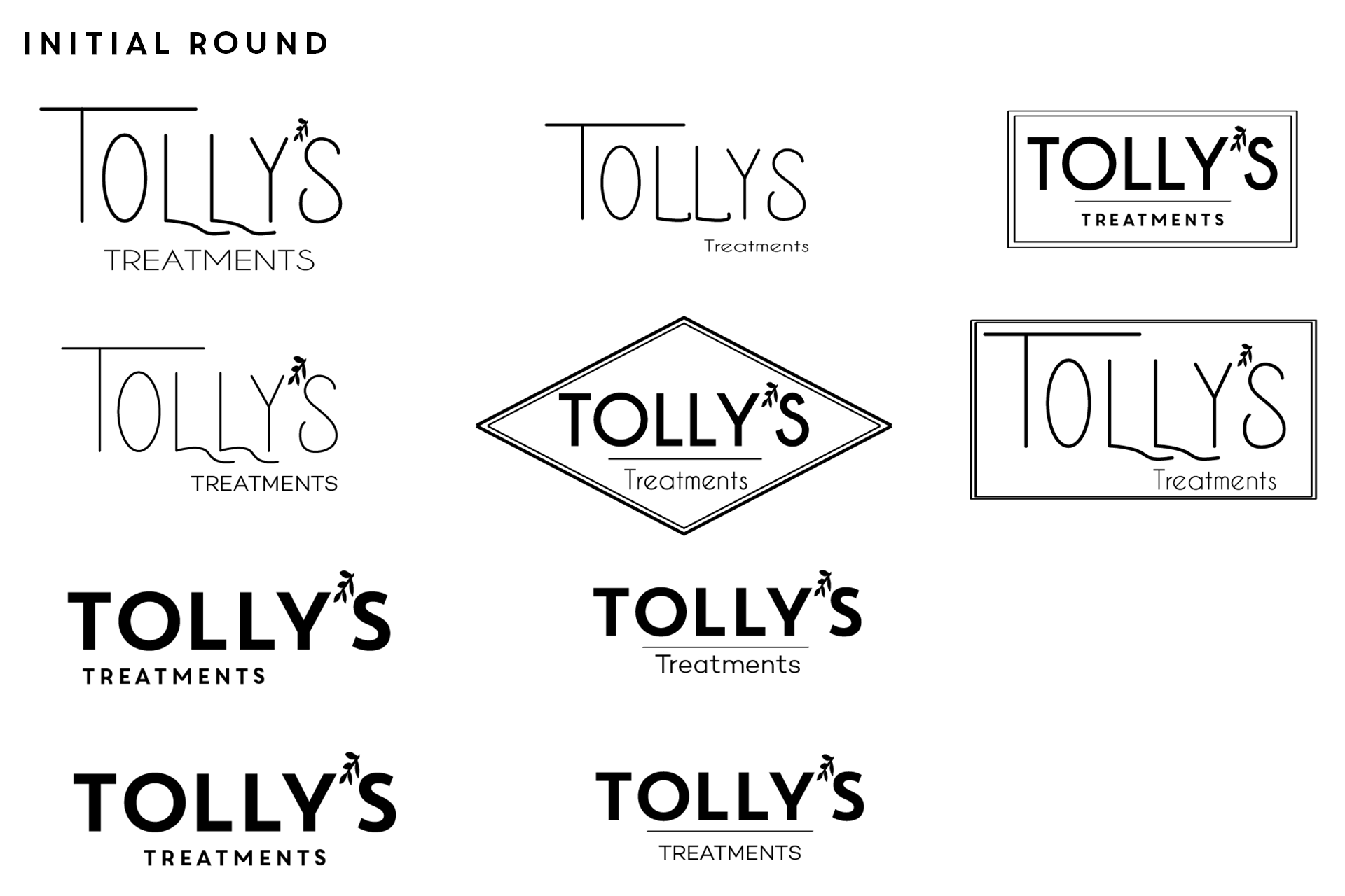
I sketched ideas with elements of eucalyptus, a flower or anything to give the name Tolly’s Treatments the identity that it is an aromatherapy company. We went through multiples rounds of iterations for the logo but nothing was resonating with the new look the client wanted. I tried a combination of fonts from something that looked like their previous logo to serif, bulky sans serif, then cursive, handwritten fonts and still nothing hit the nail on the head. I suggested that we move the project along by working on the designs for the labels then placing a few of their logo top choices into the final label design.
I brainstormed an idea of including an illustrative element into the label, I started sketching and playing with lemon slices, eucalyptus leaves, blood oranges and then I played with the text direction of the label headlines on a few designs.
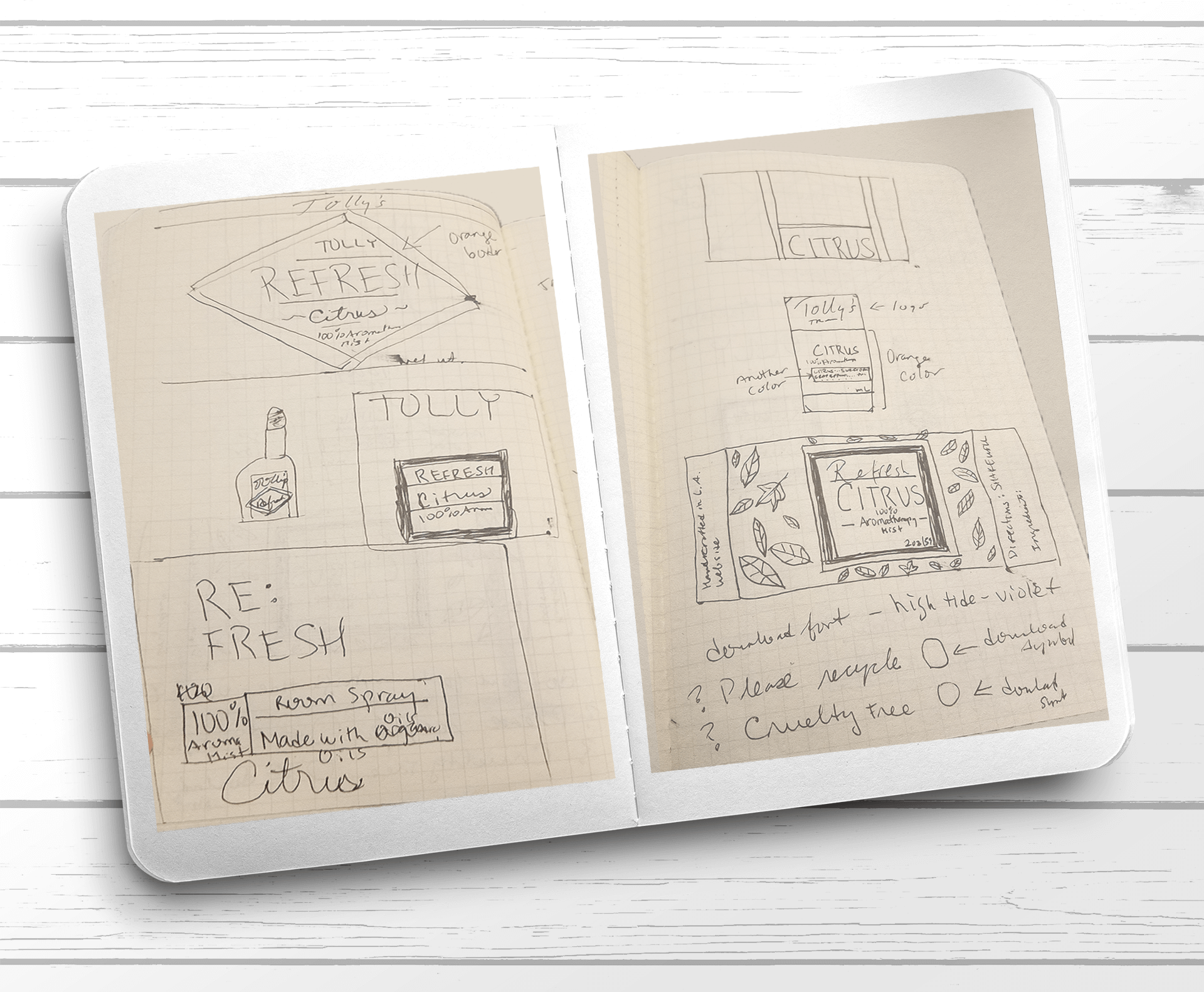
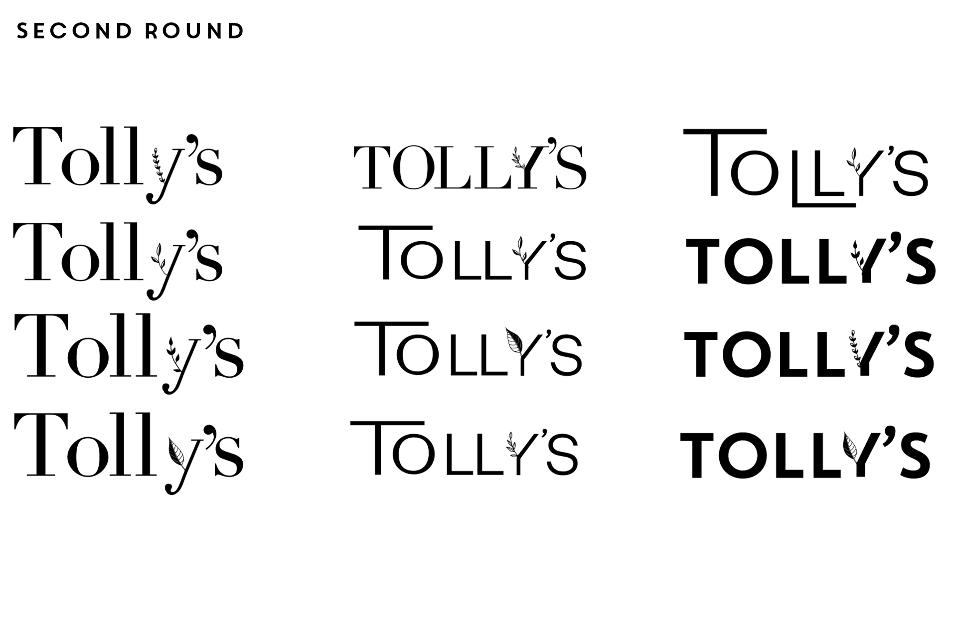
Once we settled on the background pattern I inserted their top logo choices. None were seeming like the right choice. I finally found a cursive font that was feminine and I thought looked great with the word “Tolly’s”.
I sent them this font for review and the client immediately rejoiced and said I love it, I think it’s perfect! I manipulated the font a bit in illustrator with some minor tweaks here and there and the final logo was set.
I scoured the web for free illustrations of natural elements I found an amazing line illustration curved pack. Out of this I chose a select few flowers and leaf combinations to create my own pattern and repeated it as a background on the label. The client loved this and was it was the first step in the right direction for the label design. My next goal of this redesign was to minimize the amount of fonts used on the package.

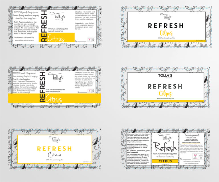
Their previous design had five different fonts. I used three fonts including the logo. I wanted the fonts to evoke the feelings listed on the label, for example Love I wanted it to be a feminine thin and mildly cursive font. I chose to update the color border by bracketing in the “Blend” and this way all of the product lines were tied together with similar design.
The client really liked the idea having one line printed on metallic, the client decided to have the face masks with this luxurious metallic look. I suggested we have the label background as black this brought a sense of exclusivity and elegance to this line. After a few rounds of printing, re-iterating and resizing to ensure all of the content fit on the product the labels were ready for the printer, they were all professionally printed and applied to the products.
After Mandi Tollefson saw the impact on sales the new design had, she decided to move forward with redesigning her website. I worked with her to build her an e-commerce website through Squarespace. The project took a few weeks to complete. She has seen continued to update it herself and she continues to have great success!
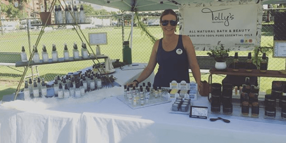
Tolly’s Treatments launched their new line on their Website and Etsy store and began selling around town on the weekends at flea markets. Her sales increased by 235% and she attributes her success to the new design. Pictured here is the owner of Tolly’s Mandi Tollefson selling at the Rose Bowl Flea Market, hanging behind is a banner I designed for her and all of the new products. I thoroughly enjoyed this project and working with her as a client and I will hopefully be assisting her again soon with a new product line that is being developed. See below a testimonial she posted on my Linkedin page.
Review by owner of Tolly’s Treatments
“I am happy to recommend Mavi for a position within design and graphic arts.
I hired Mavi looking to re-brand my small bath & beauty company, Tolly’s
Treatments, and re-design an entire line of product labels to fit. She was not only a
great pleasure to work with, but the end result has absolutely been a contributing
factor to our success this year. In the beginning stages, Mavi was inquisitive and very thorough in understanding what I wanted my brand to convey. She was extremely patient and helpful in finding, and solidifying, font options and colors to use. As we got deeper into designing, Mavi demonstrated significant skill in envisioning and creating a unique design and brand identity. Her exceptional Adobe Illustrator skills were key, as she was able to manipulate the design, font spacing, and sizing to fit several different sized product labels, which was no easy feat. In the end, she was very compliant in delivering the assets how I needed them for printing and web use.
Despite being given a huge workload for one of her first hired design jobs,
Mavi handled everything with grace and professionalism. I have hired her again
since to create banners and other things for my business and will continue to do so,
if she is available. I have no hesitation that Mavi would be a great addition to any
team.”