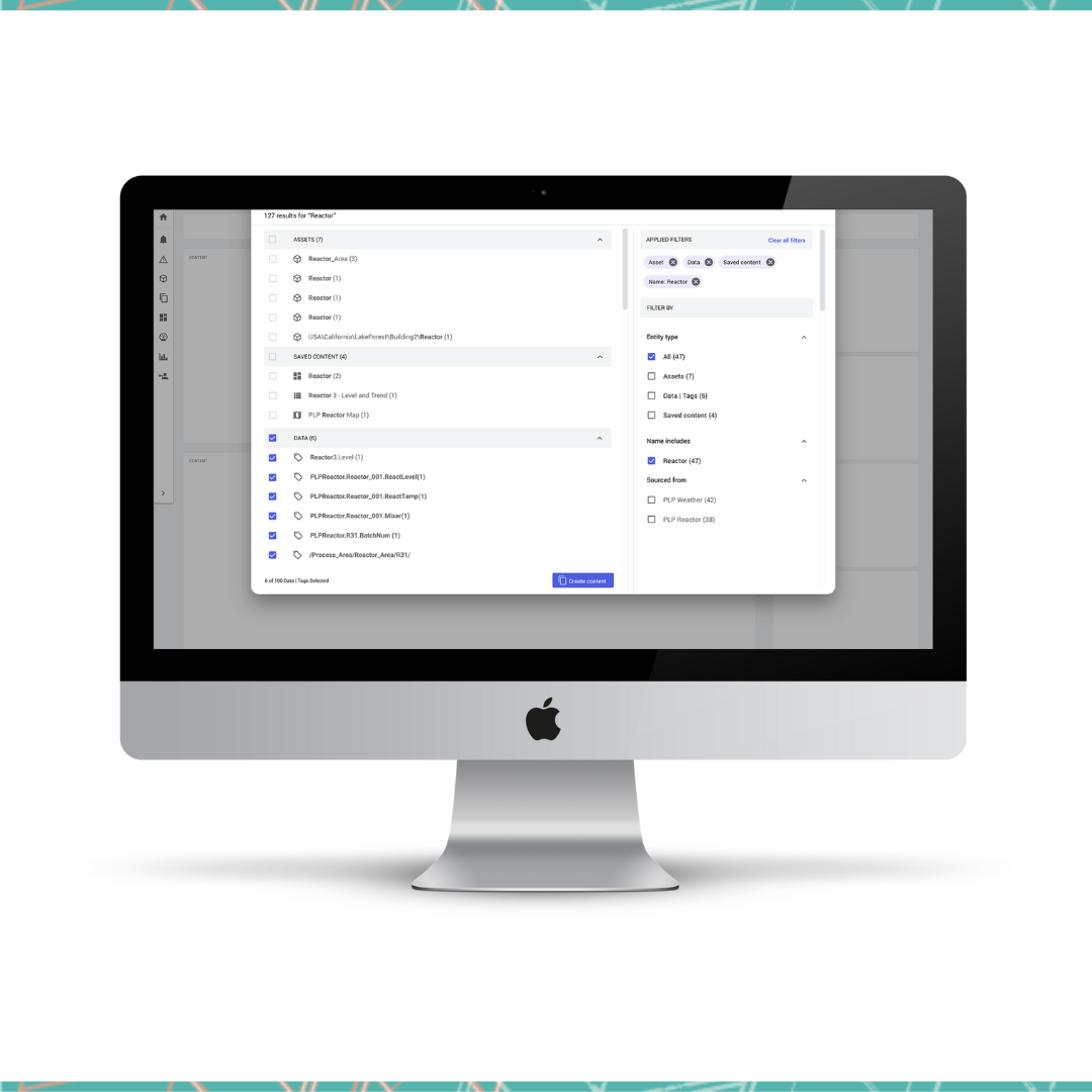
The AVEVA Insight product was in dire need of a new search experience. This project allowed the UX team to align with the development team’s plan to update the framework. The original search experience packed a lot of information into a unuseable three screen panel. It was not user friendly because it concatenated the text making it hard to use, and there was no filter. The real-estate granted for this search screen was about 25% of the screen which caused a lot of scroll bars and there were some interactions buried way down a nested tree requiring multiple clicks to get through. We improved the user experience by providing more screen real-estate (allowing search and filters to be applied more easily), removing the three panels (consolidating into one main panel), and adding in collapsible sections (to narrow down user results). These functions along with other features allowed for direct navigation, tag vs. asset searches and more.
Details:
Duration: 6 months
Tools: Adobe XD, Miro, Notebook and a Pen
Team: 1 of 2 designers plus UX Director
My Role:
Performed competitive analysis
Created wireframes
Was involved with user testing
Designed the UI of the search experience
Created a high fidelity prototype
Continue to collaborate with development to ensure design quality is achieved.
The Challenge:
Can we solve all of the original problems that the original search experience created for customers with a tight timeline and budget?
The Challenges
There were a lot of challenges with this project. It required a short turnaround and the budget for development did not allow for all of the improvements necessary. The biggest challenge for me was that a new team leader was hired in the midst of the project leaving me with unanswered questions, pending direction and a lot of re-work.
The Requirements from the Product Manager
Search should show results in single sheet as the user types on their keyboard. Drop the 3 panel search and utilize all available real estate
Keep the “sections” approach that we have for assets, tags, content, etc.
The results available should provide options for actions to be taken directly
Old search experience analysis
Layout with three small panels
Ineffective use of real estate
Concatenation of text
Displaying long tag names
Non-responsive design
Usability – Navigating within search result panel
Research Phase
Google Developers
Google Drive
Domain.au
Walmart
Target
Lowes
Dropbox
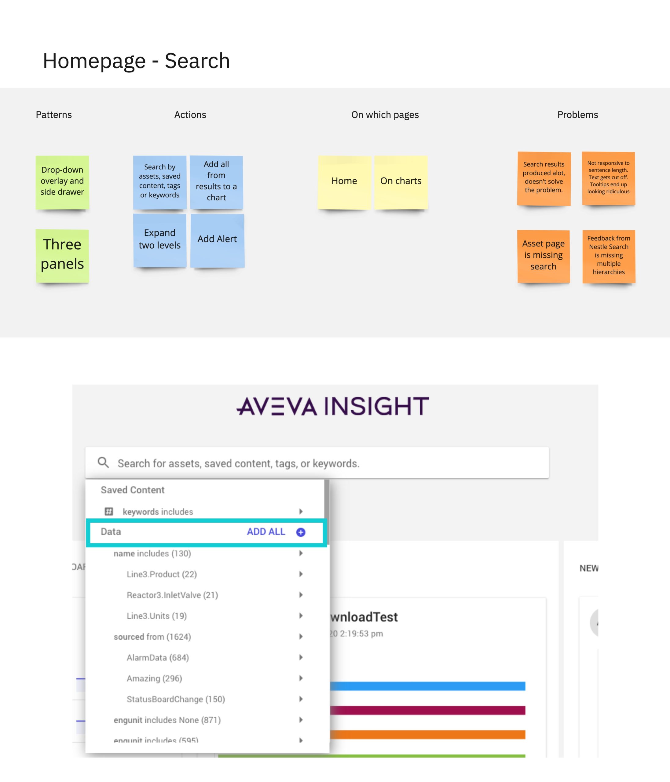
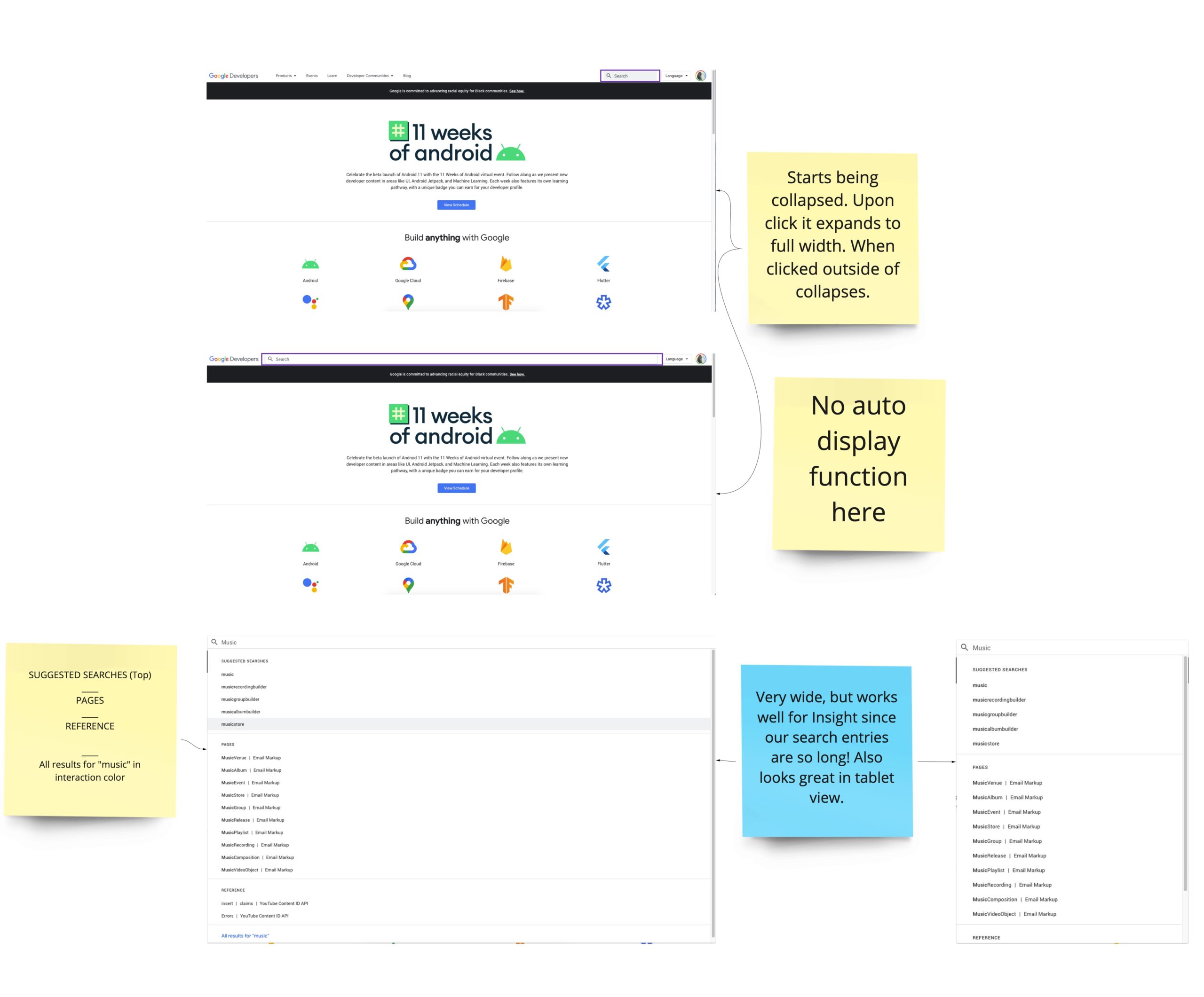
In collaboration with my new team leader we researched what most commonly used features are used for search. The best experiences found were those that Walmart, Lowes, Target and Google Developers had and we used them as inspiration. We wanted to give customers a familiar experience. We put together a board in Miro with screenshots and details. We shared the ideas with the product owner and discussed ideas of concepts that could be implemented within the budget.
User Testing
A different development team was working on deploying a version of search from a different product that had recently merged with AVEVA. With that experience a VOC (voice of customer) process began. The UX director interviewed several customers and asked them about multiple parts of the experience. The purpose was to gather customer feedback and make upgrades. With the results of this test I worked on the redesign for Insight.
Ui Redesign of Search Experience
I proceeded to create wireframes and once those were approved, I created the full UI experience and prototype to share with managers, UX team, and product owner. It was reviewed and the process was iterated several times to align with other AVEVA products. Seven versions later, a copy of the prototype was shared with the development team and they worked on implementing it.
After a few sprints, the product was launched live into the new framework of the product, however the implementation was not as detailed or pixel perfect as the design that was provided. I collaborated with the development team to make these changes. It is currently still being modified to ensure the correct actions appear, for example: one primary button, upgrades for errors, and updates to the filters.
Future Improvements
I’m continuing to provide feedback for upgrades that can be made, including future work on implementing a search results page and a collections bucket.